Key takeaways
- Compare paint sheen on textured walls with matched sample records, normal and oblique viewing positions, and a practical decision worksheet.
What's inside
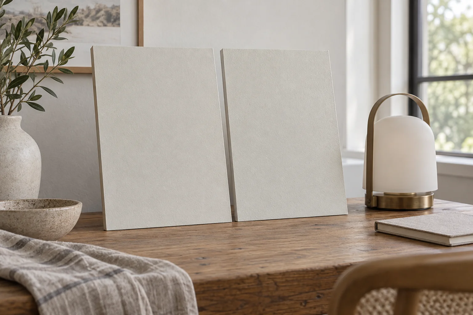
Compare paint sheen on textured walls by keeping the color, coating system and texture as consistent as possible, then looking from the places where you actually use the room. A smooth color card cannot show how a raised wall pattern will catch light. The useful result is a record of which finish makes that particular texture more or less noticeable under your normal lighting.
This comparison is about appearance. It does not prove washability, adhesion or service life, and it should not involve sanding an unidentified existing wall finish simply to make a sample area.
Separate color selection from finish selection
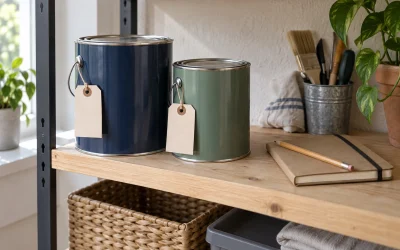
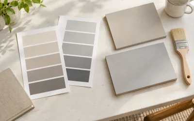
Choose a short list of finishes within the intended paint product before comparing them. Write down the manufacturer, product line, color code and finish name for each. “White eggshell” and “white satin” from unrelated products may differ in more than sheen, so a result from that pair cannot isolate the effect of finish.
Benjamin Moore’s sheen guide explains that sheen concerns reflected light and that a gloss finish can accentuate surface blemishes. It also distinguishes several finish names within its own range. Use those principles to frame the comparison, while checking the exact product’s application and care instructions separately.
Do not assume every sample pot reproduces the finish you intend to buy. Record the finish actually supplied. A sample in one sheen can help narrow color choices, but it cannot settle a comparison between two other finishes.
Make the texture relevant
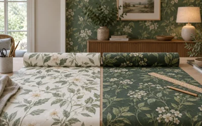
The comparison surface should resemble the wall you are deciding about. A spare textured panel may be useful if its pattern, preparation and coating system are representative. A smooth board is still informative about color, but label its limitation clearly rather than presenting it as a textured-wall test.
If you plan permitted sample areas on the actual wall, first establish that the surface and proposed preparation are suitable. Follow the coating instructions and obtain appropriate advice if the old finish or substrate is unidentified. This guide does not recommend disturbing old coatings or adding a new texture merely for the comparison.
Keep each sample’s preparation record. Differences in primer, coat count, application method or drying stage may explain a patchy result. Wait for the product’s specified viewing or drying conditions rather than comparing one freshly painted area with another that has been dry for days.
| Record | Sample A | Sample B |
|---|---|---|
| Product, color and finish | Exact label details | Exact label details |
| Surface and preparation | Texture, primer, application | Texture, primer, application |
| Viewing condition | Position, light, date | Same position and light |
| Raised texture | Where highlights appear | Where highlights appear |
| Normal-use preference | Reason, not a score alone | Reason, not a score alone |
| Unresolved issue | Mismatch or product question | Mismatch or product question |
Use both ordinary and revealing views
Start at the normal viewing position: the doorway, sofa or dining chair. Describe what draws your attention before moving closer. If the wall is usually a quiet background, the important question may be whether its raised pattern becomes more prominent than the furniture or artwork.
Then look along the wall from an oblique angle. Record the existing window and lamp conditions instead of inventing a universal inspection angle. A light positioned to exaggerate every ridge can reveal differences, but that view should remain separate from your everyday-use judgment.
Observe each sample from the same places. If using movable panels, exchange their positions and repeat the observation so the panel nearest a window does not automatically become “the shinier one.” Keep the panels secure and outside circulation routes. Do not move lighting into an unsafe position to produce a dramatic photograph.
Worked example: the hallway wall
In a fictional hallway, a household compares the same pale color in two available finishes on representative textured panels. From the entrance, both look acceptable. From the chair beside the window, Sample B produces a more noticeable line of highlights across the raised pattern.
After exchanging panel positions, the difference remains noticeable to the household. They record that observation, then check whether Sample A’s exact product suits the planned use and care requirements. They have identified an appearance preference; they have not demonstrated that Sample A is more durable or easier to clean.
If the difference disappeared after the position swap, the next step would be another controlled observation. Buying a large quantity on the basis of the original window-side placement would leave an important uncertainty unresolved.
Keep the decision attached to its conditions
Store the sample labels and notes with the final paint specification. Record any changes between the comparison and the actual project, including a different product line or preparation method. Those changes can make the original result less representative.
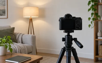
A photograph can help remember where the highlights appeared, but screen processing and viewing conditions affect what others see. Use it as a note beside the physical comparison. The finished decision should name the chosen coating and explain why its appearance worked on your texture, rather than declare one sheen universally best for every textured wall.