Key takeaways
- Compare wood undertones, grain and sheen using physical samples and a room palette worksheet before choosing new furniture finishes.
What's inside
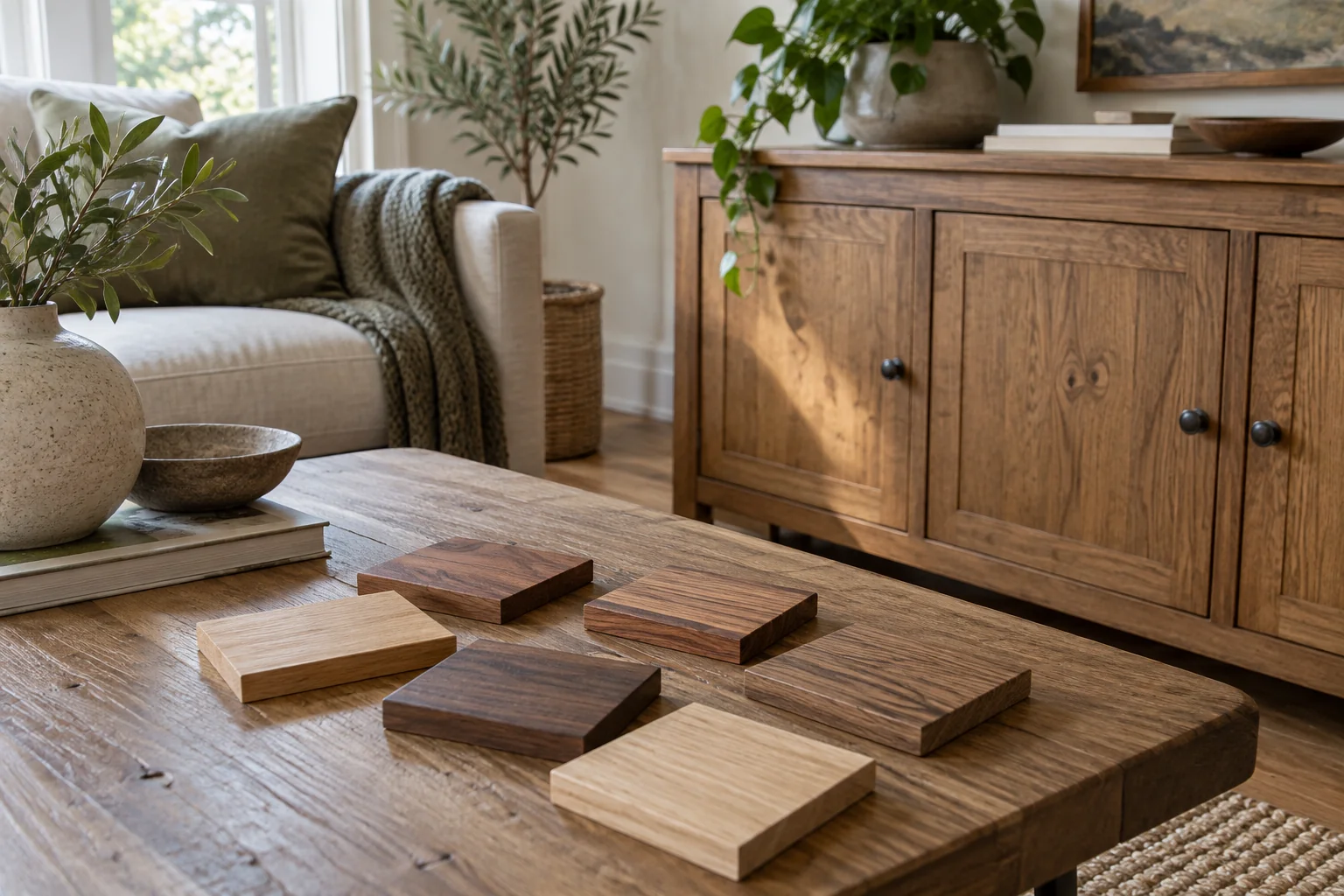
Compare wood tones using physical samples beside the finishes that will stay in your room. Record undertone, lightness, grain and sheen separately. A light wood can look warm, and a dark wood can look cool; calling both simply “brown” hides the difference you need to evaluate.
The useful result is a short material comparison sheet, not a rule that every piece must match. This method helps you decide whether a new table relates to an existing floor, cabinet or chair before you commit to a large purchase.
Start with the wood you are keeping
List the fixed or difficult-to-change surfaces first: flooring, built-in cabinetry, doors and a large inherited piece. Include the actual finish, if known. “Oak” identifies a species; it does not tell you whether that particular surface has a gray stain, amber coating or pale finish.
Choose one main viewing position, such as the doorway or sofa. Note which wooden surfaces are prominent from there. A wide floor and a narrow picture frame should not automatically receive equal importance just because each counts as one item. Write “large background,” “main furniture” or “small accent” beside each.
Photograph the room for a location record, but make final color comparisons in person. If you cannot obtain a flooring offcut, carry the furniture sample to the floor instead of judging it beside a screen image. Ask the supplier whether the sample represents the current finish and what natural variation to expect.
Separate four observations
Room & Board’s wood-mixing guide proposes shared undertones, repeating woods and using a wood with varied colors to connect different finishes. These are design options, not requirements. Its examples also distinguish stained and unstained finishes, a useful reminder to compare the finished surface rather than the species name alone.
First describe the apparent undertone: yellow, reddish, grayish, neutral-looking or uncertain. Next record how light or dark it looks against your existing surface. Then consider whether the grain is quiet or conspicuous. Finally note whether reflections from the finish draw your attention. Keep these observations in separate columns so one strong feature does not obscure the others.
| Surface or sample | Apparent undertone | Lightness and grain | Role in the room | Decision to test |
|---|---|---|---|---|
| Existing floor | Record in daylight | Light/dark; quiet/strong | Large background | Keep fixed |
| Existing cabinet | Record beside floor | Include visible sheen | Main furniture | Use as comparison anchor |
| Candidate A | Warm/cool/uncertain | Compare, do not guess from name | Proposed table or chair | Keep, reject or revisit |
| Candidate B | Repeat same conditions | Record differences from A | Same proposed role | Keep, reject or revisit |
Compare samples where the furniture will stand
Put each sample near its intended location. Hold a cabinet-finish sample vertically if that is how most of the finished surface will be seen; lay a tabletop sample horizontally. View it beside the floor and then beside the closest existing furniture. Avoid deciding from a sample propped against an unrelated bright wall in another room.
Repeat the comparison during your usual daytime and evening use. Record the lights and curtains you used, so you can repeat the conditions. If one candidate seems acceptable only when a lamp is switched off, that is useful information. Do not replace your everyday lighting routine merely to make the sample pass.
Keep sample labels on the back or on separate notes, following any return conditions. Similar samples become easy to confuse after moving them between rooms. A quick photograph of the labeled arrangement helps preserve which option you were comparing, even though the photograph is not the color verdict.
Worked example: two tables beside one floor
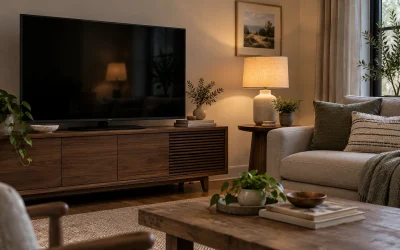
In this illustrative room, the floor looks golden, a large cabinet looks reddish-brown, and two table samples are available. Sample A is pale with a gray cast; sample B is medium brown with a reddish cast. Neither is automatically wrong.
The homeowner records that A gives the strongest light/dark contrast with the cabinet but looks detached from the floor at night. B relates to the cabinet yet makes the seating area feel visually heavy. The next comparison is therefore a smaller table footprint in finish B, rather than buying A simply because it is lighter.
This is a preference-based decision, not a measured performance result. Another household might deliberately choose the contrast of A. The worksheet makes the reason explicit: the choice concerns how the actual finishes appear together, not a belief that cool and warm woods cannot share a room.
Make one decision before buying more accents
If the room feels unsettled, change one proposed finish at a time. Buying several matching accessories before choosing the large furniture can leave you committed to a palette you have not tested. Use objects you already own to explore repetition before adding anything new.
Keep the final sample, finish name and order details together until delivery. When the furniture arrives, compare it with the agreed reference under the same viewing conditions and contact the supplier about unexpected differences. A small sample cannot promise an identical grain pattern across a large natural-wood surface.