Key takeaways
- Match paper to your light source: Matte and uncoated stock diffuses light and is the only safe choice if a desk lamp, window, or monitor sits across from the wall. Save glossy finishes for walls lit indirectly.
- Check the tonal range, not just the colors: Prints with mid-tone backgrounds — cream, sepia, sage — retain depth as light levels fall. Very dark or very pale prints collapse into a single value in dim rooms.
- Plan for 2700K–3000K: Most home offices run warm bulbs, which pull yellow-green forward and mute blues. Vintage maps and aged botanicals are engineered for this shift; cool modern graphics fight it.
- Size to viewing distance: At a typical 6–8 foot desk-to-wall distance, 11×14 sheets are the sweet spot. Reserve 4×6 mini prints for tight collage clusters seen up close.
- Protect against fade: Keep unframed sets
What's inside
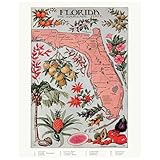
Table of ContentsThe best overall pick is the Florida Map Vintage Wall Art 11×14 Retro State Poster, and the runner-up is Vintage Botanical Prints: Eighth Edition. The Florida map wins because its aged-paper palette and citrus tones hold their character under warm 2700K light, where cooler-toned prints tend to go flat and gray.
Most gallery walls fail in the evening, not the afternoon. Buyers choose prints under bright showroom daylight, hang them in a home office lit by a single desk lamp and an overhead fixture, and wonder why the arrangement looks muddy after 5 p.m. Paper sheen bounces glare straight back at the desk chair, dark botanical linework disappears into shadow, and a wall that photographed beautifully reads as clutter. This guide evaluates six botanical and vintage-map print sets the way a lighting designer would: how each one behaves under warm versus neutral light, how its finish handles reflected glare from a screen or lamp shade, and how the tonal range holds up when the ambient level drops.
As an Amazon Associate we earn from qualifying purchases at no extra cost to you. Product prices and availability are accurate as of the date shown and are subject to change.
 $14.95
 $13.99
 $25.99
 $13.99
 $11.99
 $16.98
Quick Comparison
Product Best For Standout Feature Rating Florida Map Vintage Wall Art 11×14 A warm-lit focal anchor Citrus and aged-paper palette that glows at 2700K See card above Vintage Botanical Prints: Eighth Edition Filling a wall on a small budget Matte, low-glare plates you can cut and frame yourself See card above 97 Decor Vintage Botanical Wall Art, 12 Pcs A cohesive designer-grade grid Consistent ink density across all twelve panels See card above Lewtemi 4 Pcs Vintage Nature Posters Narrow walls and single-lamp rooms Open compositions that read clearly in low light See card above 97 Decor Vintage Botanical Wall Art, 16 Plant Posters Large, symmetrical gallery layouts Sixteen 11×14 sheets for balanced full-wall coverage See card above How to Choose a Botanical and Vintage Map Wall Art Print for Home Office Gallery Walls
- Match paper to your light source: Matte and uncoated stock diffuses light and is the only safe choice if a desk lamp, window, or monitor sits across from the wall. Save glossy finishes for walls lit indirectly.
- Check the tonal range, not just the colors: Prints with mid-tone backgrounds — cream, sepia, sage — retain depth as light levels fall. Very dark or very pale prints collapse into a single value in dim rooms.
- Plan for 2700K–3000K: Most home offices run warm bulbs, which pull yellow-green forward and mute blues. Vintage maps and aged botanicals are engineered for this shift; cool modern graphics fight it.
- Size to viewing distance: At a typical 6–8 foot desk-to-wall distance, 11×14 sheets are the sweet spot. Reserve 4×6 mini prints for tight collage clusters seen up close.
- Protect against fade: Keep unframed sets
More ways to save on AmazonAffiliate disclosure. As an Amazon Associate we earn from qualifying purchases at no extra cost to you. Prices accurate as of the date shown.8 Best Botanical and Vintage Map Wall Art…Check price on Amazon